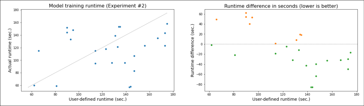
Model training evaluation using Matplotlib / seaborn scatter plot, colors on condition and custom color palette.
fig, (ax1, ax2) = plt.subplots(1, 2, figsize=(20, 5))

a = pd.Series(np.random.randint(60, 180, 25))
b = pd.Series(np.random.randint(55, 160, 25))

x_min = min(min(a), min(b))
y_max = max(max(a), max(b))

sns.scatterplot(a, b, ax=ax1)
ax1.plot([x_min, y_max], [x_min, y_max], ":", color="grey")
ax1.set_title("Model training runtime (Experiment #2)", size=16)
ax1.set_xlabel("User-defined runtime (sec.)", size=14)
ax1.set_ylabel("Actual runtime (sec.)", size=14)

data=pd.DataFrame({"a":a, "diff":(b-a), "cond":((b-a) <= 0) * 1})
sns.scatterplot(x="a", y="diff", data=data, ax=ax2, hue="cond",
                palette={0: "tab:orange", 1: "tab:green"}, legend = False)
ax2.axhline(y=0, xmin=a.index.min(), xmax=a.index.max(), linestyle=":", color="grey")
ax2.set_title("Runtime difference in seconds (lower is better)", size=16)
ax2.set_ylabel("Runtime difference (sec.)", size=14)
ax2.set_xlabel("User-defined runtime (sec.)", size=14)

plt.show()
Output: